Tim Hoyle, CFA, Co-Chief Investment Officer
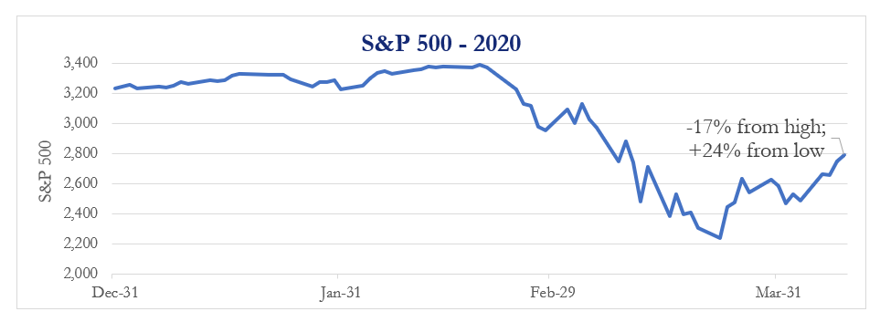
As of April 9th, the S&P 500 is up 24% from the March 23rd low of 2,237. This advance occurred in only 13 trading days! Markets are still down 17% from the highs set on February 23rd and down 3% from a year ago. In the 37 trading days since the market high, the S&P 500 has traveled 1,700 points—but with volatility, it feels like much more than that. In fact, adding up each day’s point move shows we have traveled 3,842 S&P points.
Despite the uncertainty in the world, from the perspective of a year ago, nothing looks amiss in the equity markets. In another scenario, investors would be ecstatic with the last three weeks; not so with the last three months. It’s all about perspective.
Perspective is a funny thing. One might focus on the past; mistakes in preparing for COVID, the loss of capital, income, and stability. Another might focus on how quickly individuals, businesses, and institutions have acted in the face of crisis. Yet another must focus on the moment at hand with illness, job loss, and the loss of life. The challenge is to keep it all in perspective, which can be difficult to do when you’re in the midst of it all.
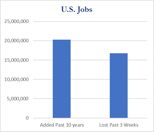
This year’s graduates are going to face a very difficult environment, similar to those who graduated in 2008. They will graduate with little to no “pomp and circumstance” to enter a job market that they don’t recognize from earlier this year, one already flooded with the 15 million workers who have been laid off in the last three weeks.
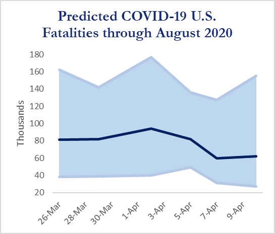
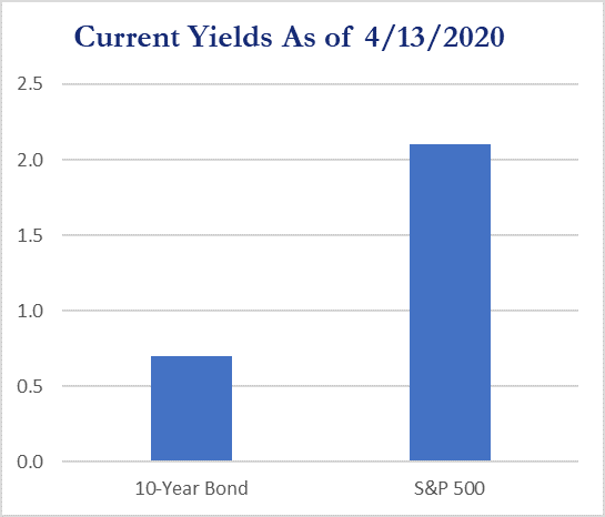
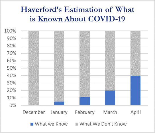
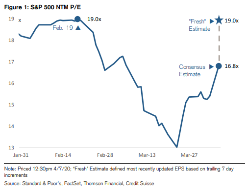
From the charts and graphics we’ve included in this week’s market update, you get the sense of these bifurcated times. Projections on COVID fatalities are down in the U.S, but over 15 million have lost their jobs. During this short period of time the S&P gained 24%. P/E ratios are back to above-average levels as earnings expectations have cratered. The spread between dividend yields and bonds yields are as wide as they have been in several generations. You can be assured that throughout it all, just as we have for the past 40 years, Haverford Trust will be here with you and for you, to discuss your goals and challenges, and to help chart the options of what financial course to take.

Source: FactSet Research Systems
Source: Institute for Health Metrics and Evaluation (IHME)
Source: FactSet Research Systems
Source: FactSet Research Systems

Index returns are provided for illustrative purposes only. Indices are unmanaged, do not incur fees or expenses and cannot be invested in directly. Past performance does not guarantee future results.
